Homie uses a powerful mix of Artificial Intelligence and advanced IoT solutions to create unique smart-home services. Homie allows its users to avoid energy waste, save money, while living in a smarter, sustainable, and energy conscious way. The mobile App, the Hub and the cloud based engine, are the three key elements of the HOMIE solution. They perfectly work in concert to deliver a meaningful and really enjoyable user experience.
Why we have chosen HOMIE? What’s behind this name? A friend of your neighbourhood or town, a member of your group of people and peer. This is the reason. It means someone close to us, who lives where we live and shares our places and habits. HOMIE sounds friendly in many languages and it has the exact meaning we wanted to give to our solution.
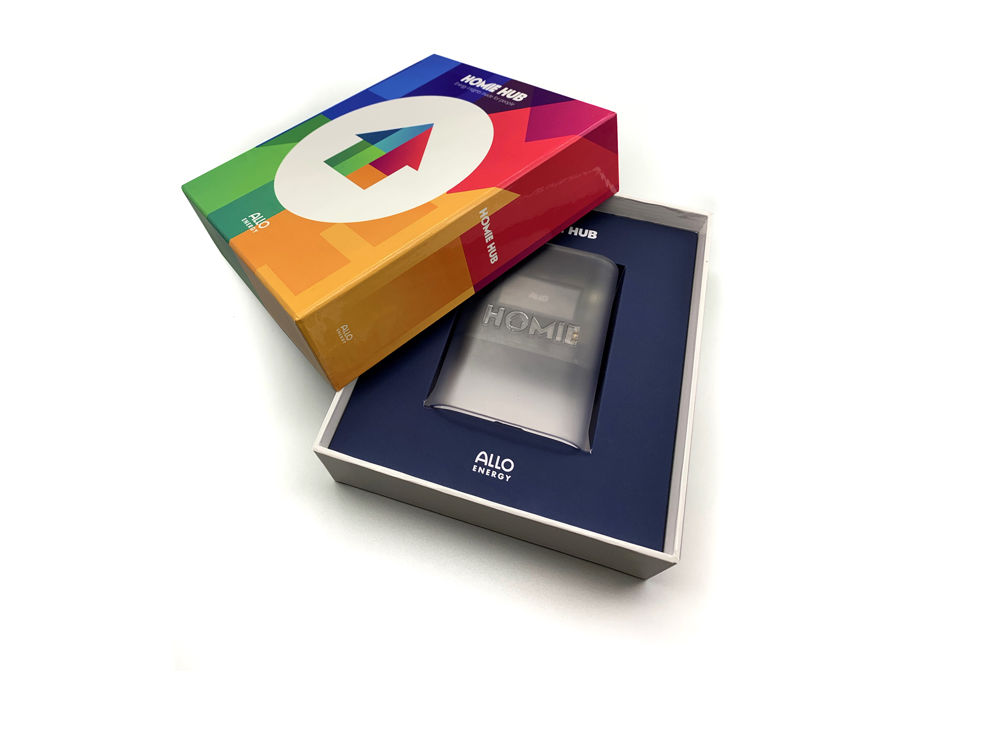
The corporate image of HOMIE was developed to be easily recognisable, and starting from its logo, the focus revolved around creating a design that could be applied to any media or support while maintaining its identity. It was adapted to a few pixels to be displayed in the app header, or engraved on the body of the monitoring device, always without losing its recognisability.
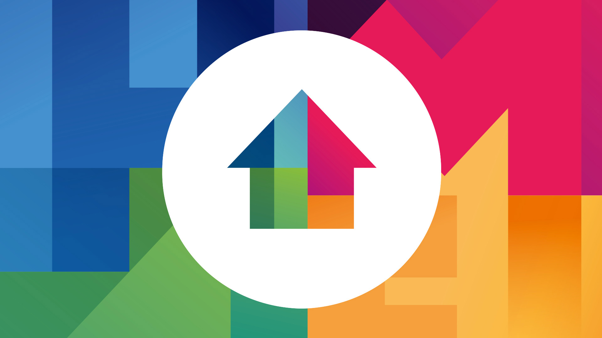
The HOMIE brand was further enhanced by the development of this image, which is present throughout HOMIE's communication, from the app and website to packaging and advertising communications. This image encapsulates many key elements of HOMIE: the logo is prominently displayed at the center, surrounded by the letters H M I E, which embrace the logo and create a colorful background using the same colors found in the main sections of the monitoring app. A lot of HOMIE's branding is encapsulated in this single image.
The electricity by its nature is not visible, is intangible, odourless, and all our human sins cannot have perception of it (of course excluding unpleasant and dangerous accidents).
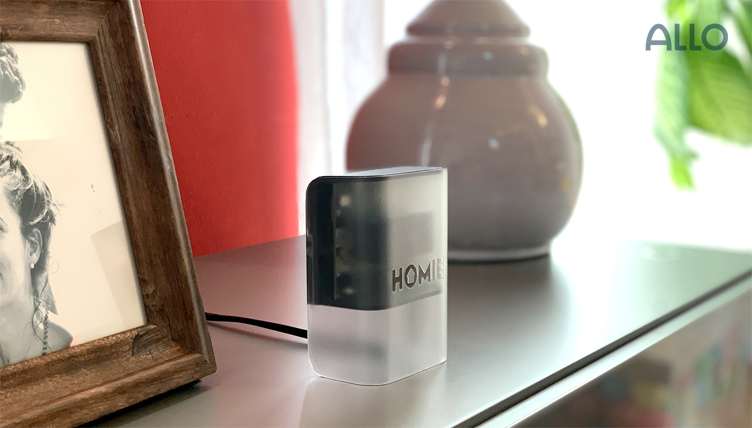
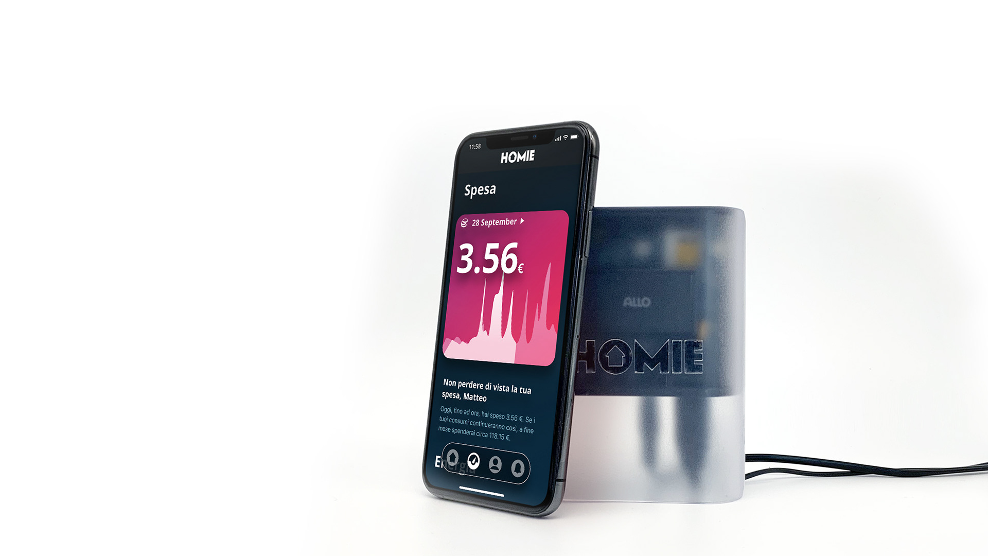
We cannot directly see with our eyes the electricity that every day we use and which allows to perform the essential tasks and activity we usually do, giving them for granted. During the development of the HOMIE Hub we wanted to work exactly around this concept: with its transparencies, the HOMIE logo makes “visible” what naturally is not. Not only the technology inside the product, but thanks to its capabilities also the electricity that it is constantly measured and monitored by HOMIE Hub, becomes for the fist time “visible” and more understandable.
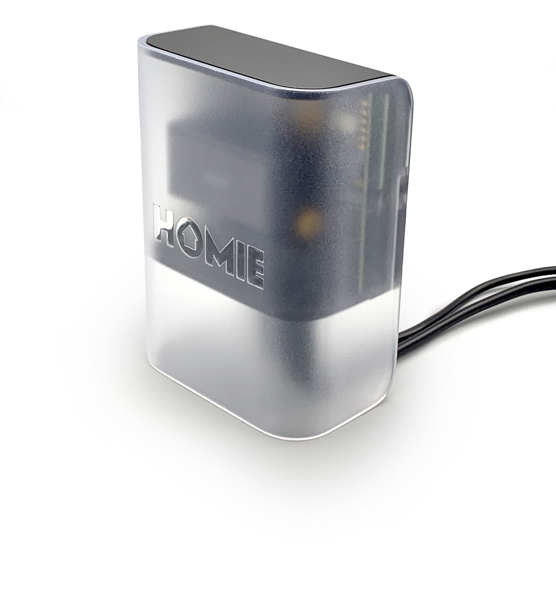
Great care was also given to creating aspects and objects that might initially seem secondary, such as the product's nameplate labels. In the case of the HOMIE Hub, these labels not only serve an informational purpose but also have a specific functionality useful for configuring the device via the app. Therefore, they required very stringent technical constraints, which were implemented without neglecting HOMIE's brand stylistic guidelines.

The development of the corporate image for the HOMIE solution also involved creating and formatting user manuals for the entire system, as well as more specific manuals for device installation. These manuals needed to be easily understandable for people without a technical background in energy monitoring, so they had to use clear and straightforward language and structure. Additionally, they needed to be accessible online and directly within the HOMIE app. Therefore, every aspect of their design, from the font and sizes to the icons and colors, was developed specifically to meet these needs while maintaining a strong and clear connection to the HOMIE brand.


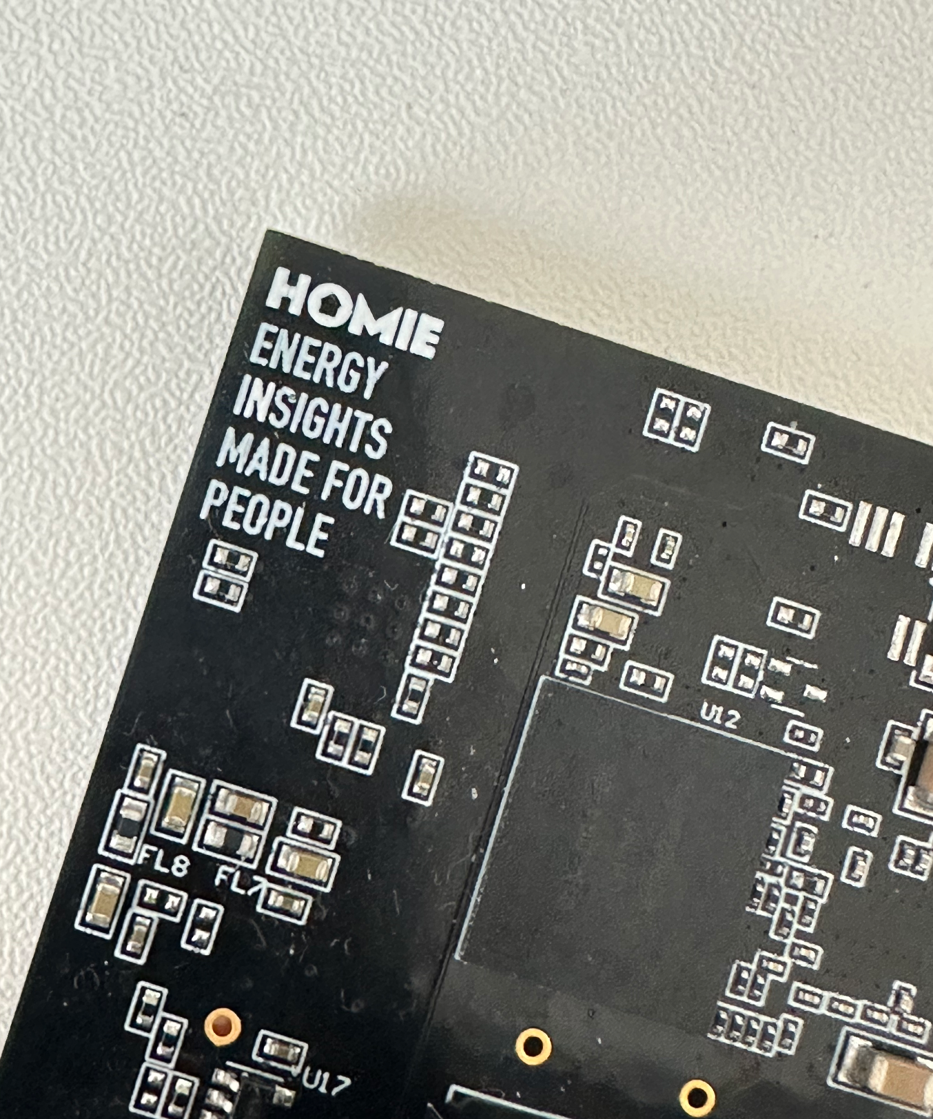
The HOMIE Hub PCB boards themselves are an example of how the HOMIE brand, with its stylistic guidelines, can be applied to different media without losing identity and recognisability.