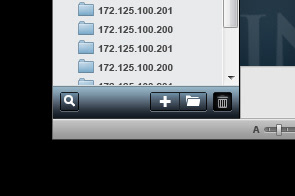
Controlling remotelly hundred fo TCRs instilled in differnt branches around a country could be a complex task. The purpose of this User Experience and Interface development was centred on making easy and efficient the interactions with multiple devices and their parameters, this without simplify where the losing of details can reduce the capacity of interaction, like design a plane cockpit.
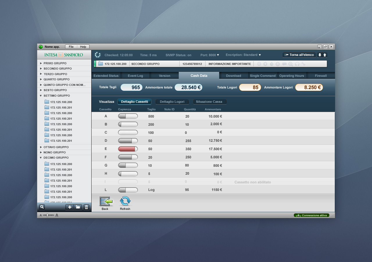


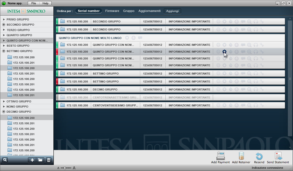
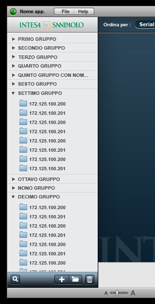
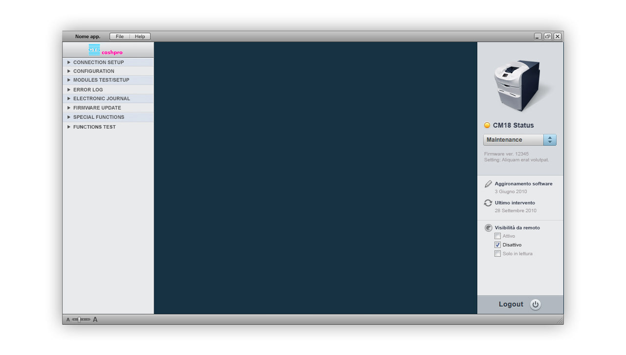
The UI is based on a simple 2 columns layout, groups and devices on the left and detail or parameters on the right, easy and by far it's represent a standard very familiar layout for all kind of users.
The elements that compose the interface are very simple and flat. This helps our B2B customer (distributors or banks) to customise some details, like logos and background, to make this sw their own sw.
This is the CM Remote Monitoring Icon: a clear representation of effective and easy controls.
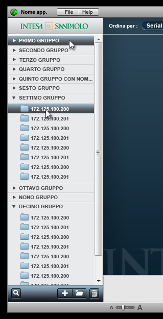
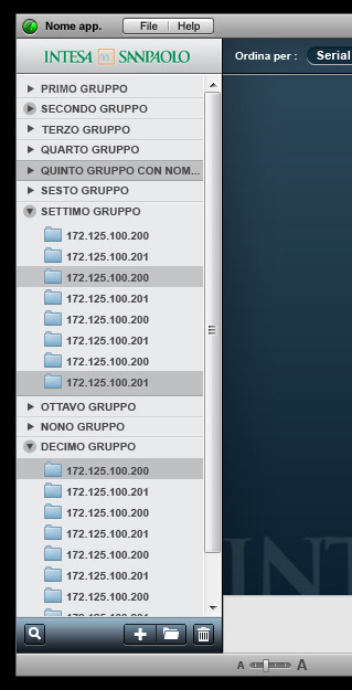
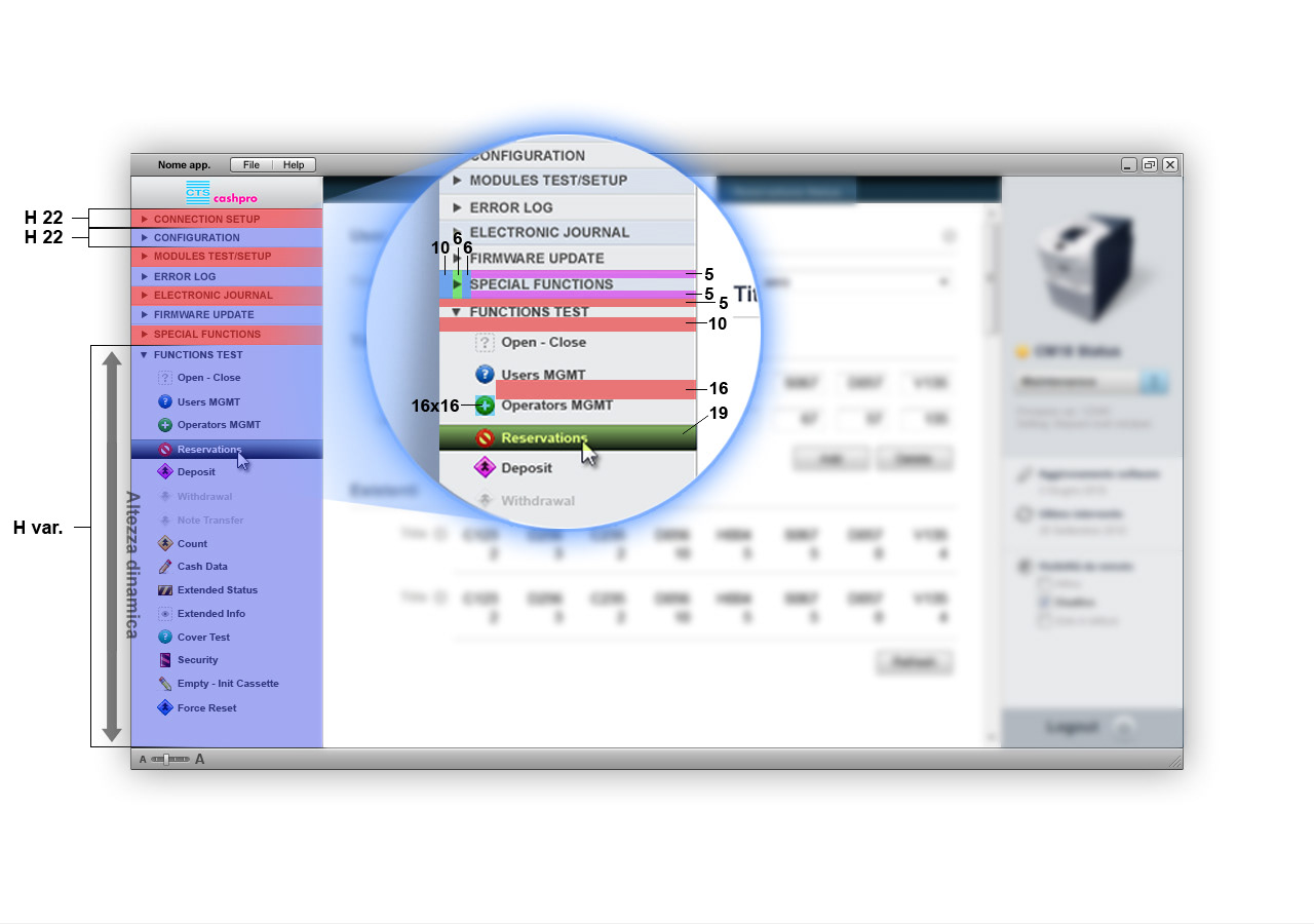
Studies to make simple to understand the interaction aspect, like selection or clicking status, of groups and devices listed in the column. These seem not relevant details but after decades of interacting with PCs they become an important and almost natural part of human interpretation and comprehension of a software.


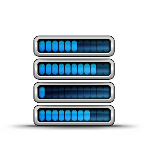
Icons are the elements that bring a bit personality on the SW.


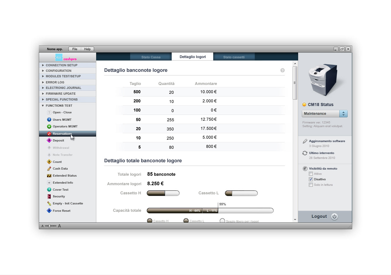
In the same SW platform is possibile to control parameters and status from a group of devices to a very single device, interacting with all its parameters and functions.
Layout studies to provide to coders all the proper information for the developments.


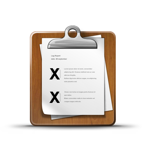
Every banks or CITs have its own way to manage and control TCRs status, so giving multiple, comprehensive and clear informations makes the difference in their daily activity, simplifying complex tasks and avoiding very expensive controls if someone have to check physically every device installed.